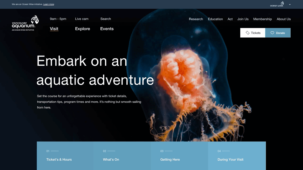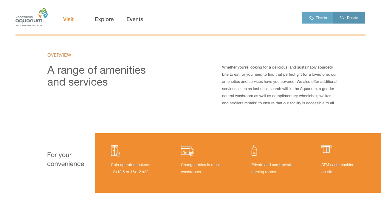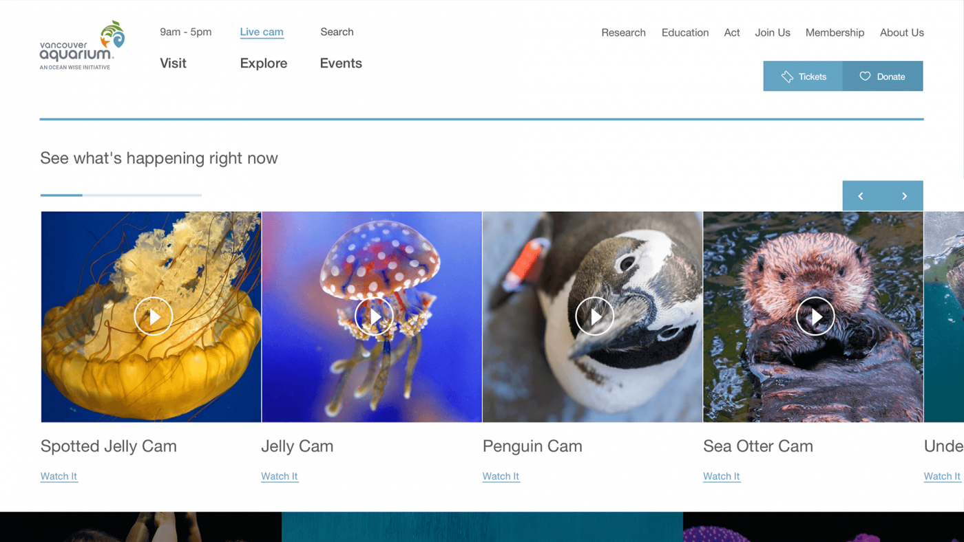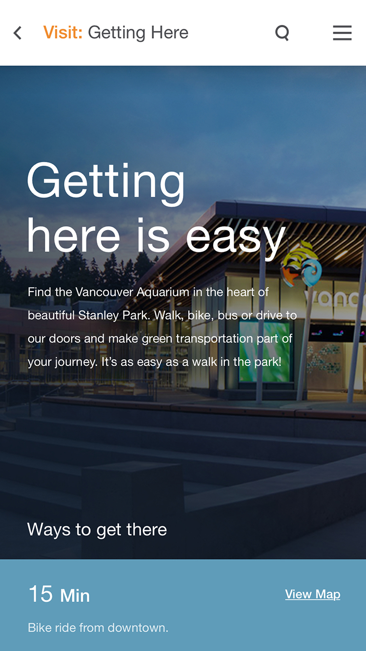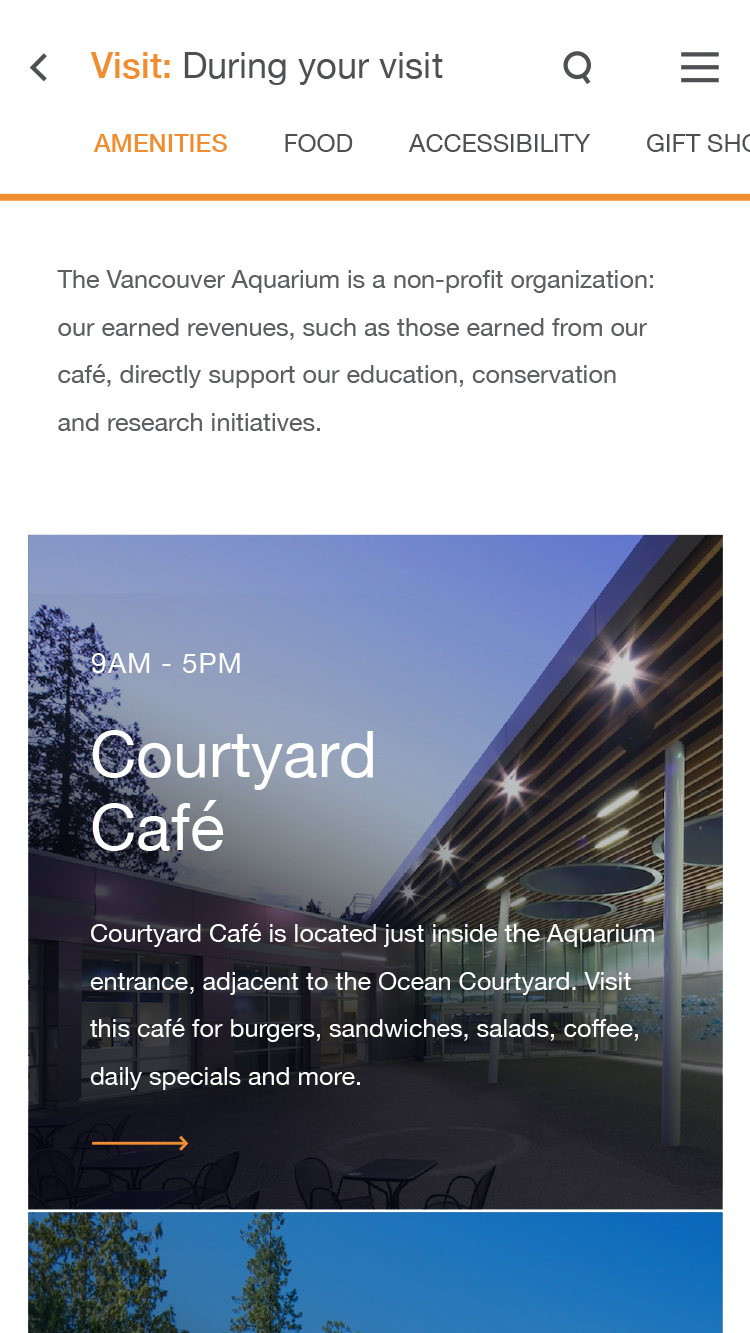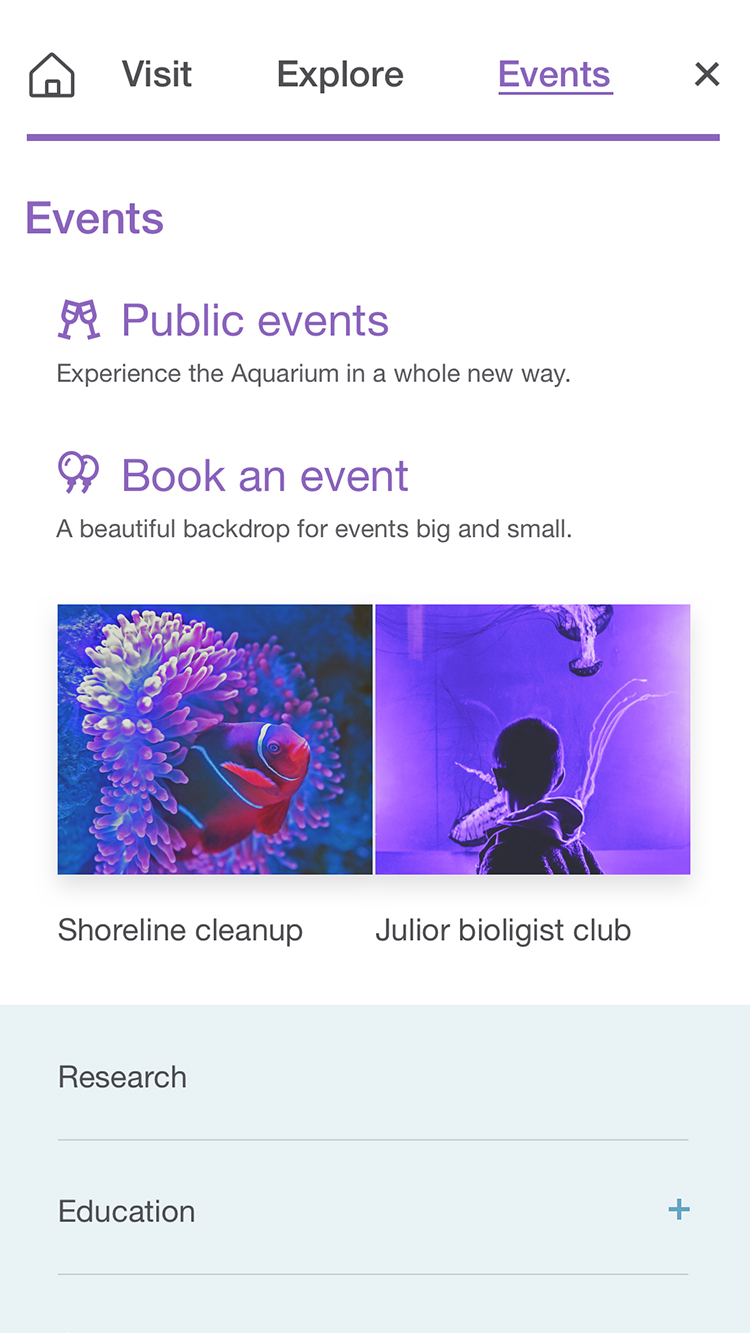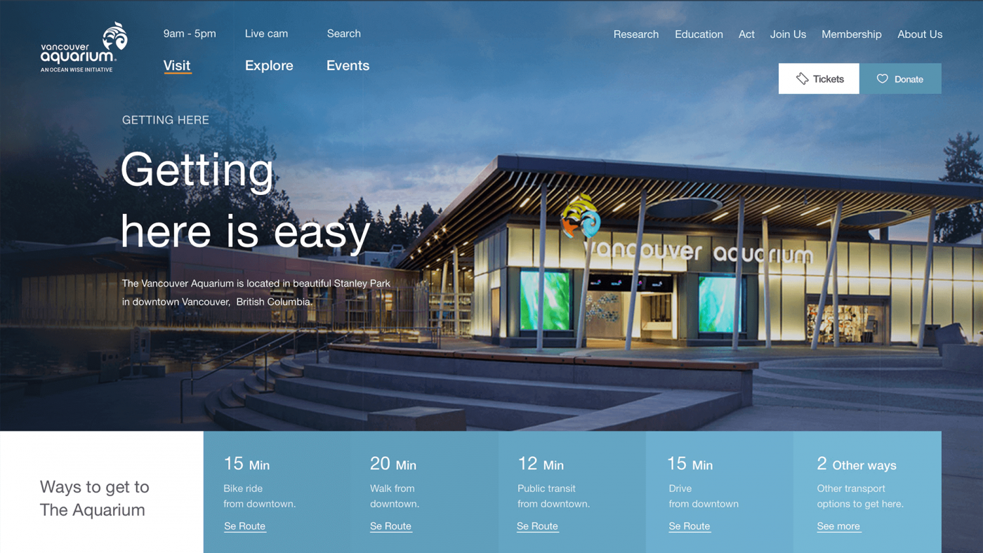


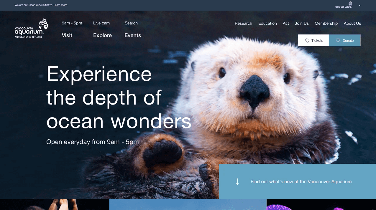
Vancouver Aquarium had a decade-old website that had grown to over 400 pages of wild chaos. So we rebuilt the site from the ground up. We created the Aquarium’s first design system, with over 30 customizable modules for every type of content. Each module was responsive, could be used anywhere, and had a consistent art direction. We didn’t stop there. We also completely overhauled their information architecture and streamlined their user experience. The new site featured visitor-centric navigation, stunning imagery, informative copy and meaningful interactions. It awakened imaginations and educated visitors about the Vancouver Aquarium and marine conservation.
We completed this project over a 6 month period, mostly with a creative team of Alex Coelho (our senior designer) and myself. I lead the strategy, spearheaded the design system and oversaw all creative efforts. It was our first foray into design systems, so I worked closely with all parties to plan and execute the system.
Credits
Thinkingbox
Vancouver Aquarium
